
Font Choices


One of the first tasks involved with creating both a magazine advert and a digipak is choosing a font to use. Planning ahead will help consistency if we use the same font or help us foresee how we might want to differentiate the two products. My first option for a font appropriate for The Wheels Fell Off would be Johnston Underground, the font used for London's buses and underground subway. This is appropriate because the song makes mention of a bus at the start of every verse, and the band being proudly British makes the iconic London buses an ideal place to look for inspiration.
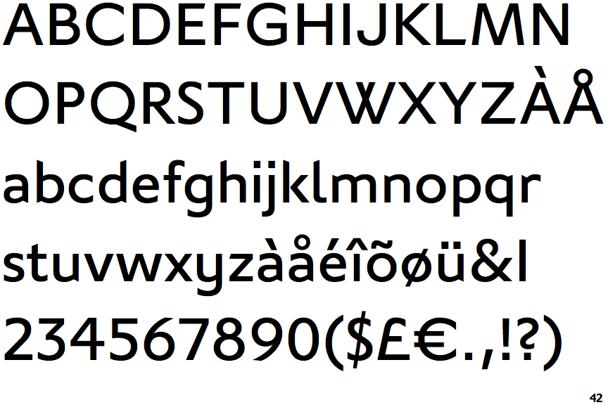
Our next font comes directly from the Hoosiers. While it is quite simple and apparently nameless, this font is very relevant to the song. It is the font used for the album The Wheels Fell Off came from, The Secret Service, as well as being used for the lyric video of the song itself, as seen to the left. Using it again for either the advert or the digipak will help consistency as I have said above, especially if used on both products. We also already know what the title of the song would look like with this font, as it is mentioned in the lyrics, meaning we don't have to speculate as we do with the other fonts, giving us if only a small bit of foresight to our end product if we do use this font.
The next font choice, simply titled "London", is a more modern take on Johnston Underground. I feel it is a nice mid-ground between my first two choices, as it is another London bus font, yet it imbibes the blocking, eye-pleasing look of the second font. this would be an ideal option if we want to go in a slightly different, but not to far, direction from the Secret Service, as that was released two years ago and something fresh could be appealing.
This is the Hoosier's current logo:
The font is a bit different to the sans-serif fonts they usually use but that makes it all the more unique when it is used. This would not make it suitable for band details for example, but perfect for a title or strap-line. The drawback being that this will dampen the unique appeal of the font if it is used in either the magazine advert or the digipak. Another problem is the font not used for the title will need to go with the title, and this would be difficult with it looking so unique.
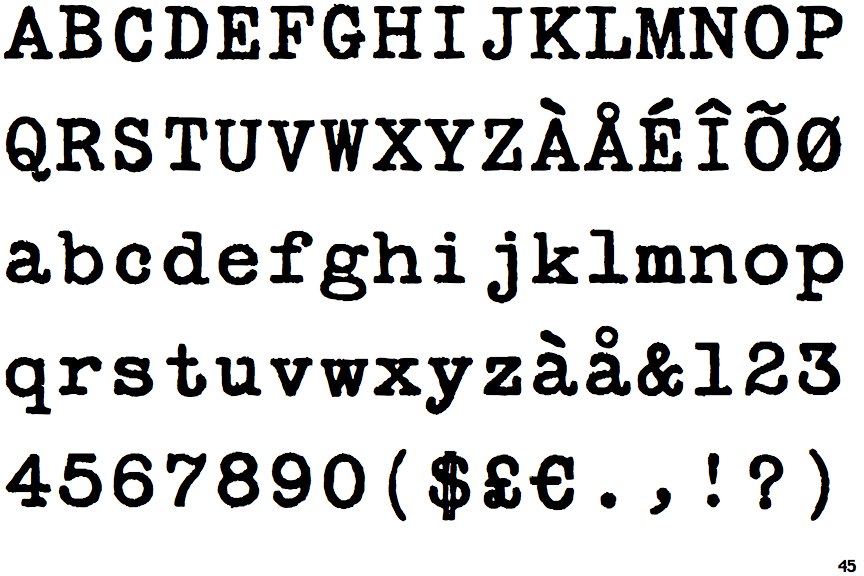
Another font previously used by the Hoosiers for another music video from the Secret Service, Up to No Good, with the font literally being called Secret Service. The aesthetic of the font works well under the circumstances of Up to No Good's video, as it is a slightly digitalized version of a typewriter's font and is associated with 1900s based investigation dramas.
This font however does not hold the same significance to The Wheels Fell Off specifically as it does for Up to No Good or the Secret Service, and I do not wish to detract from the charm it gives to the music video it is already in. Maybe a small reference to this font would be appropriate enough, such as if I used the Hoosier's title font for the title and this font as an appealing caption or something in the background like graffeti.